Friday, June 22, 2012

...Colours of Rio...

This is a beautiufl home in Rio, 120 square metres of clashing colours and patterns that meld together into an amazing amalgamation of style.

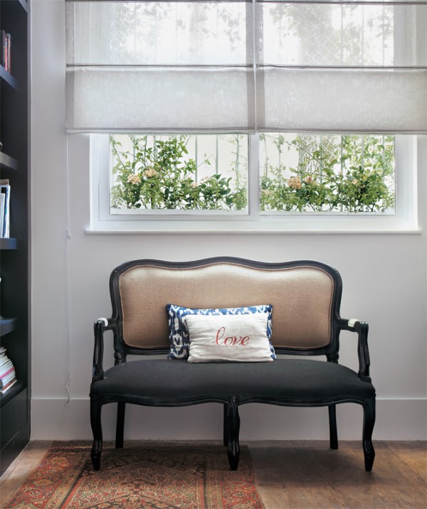
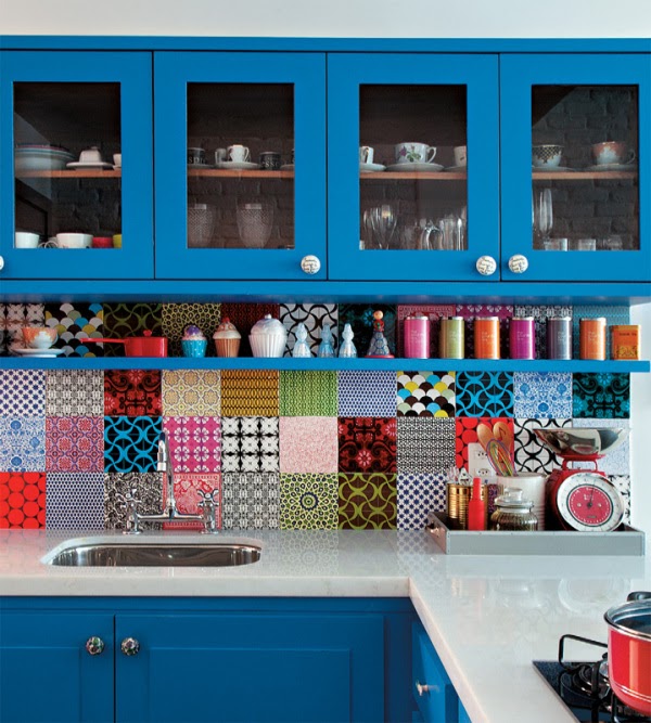
I love the aircon unit cleverly disguised in the top shelf of the bookcase in the living room, the neon sign, the mismatched chairs, that tartan wall covering in the dining area and the patchwork splashback. So much fun!


~Images via waveavenue

Wednesday, June 20, 2012

...Lerkenfeldt...

Running around Pinterest as I am wont to do, I came accross this image:


I immediately fell in love. I love dark walls, light furniture and mid toned, something about the combination is just so clean and classing.

The photographers name is Heidi Lerkenfeldt, and I can't find much information about her at all. All I know is her interiors/still life photos are beautiful.


`Images via La maison d'Anna G

Tuesday, June 19, 2012

...Islands...

I find the concept of living on a secluded island home fascinating. Apart from getting horribly seasick, I love the idea of the solitude, and the chance to build a dwelling that is perfectly centered within nature.

This house stands on an island several kilometres from Stockholm, Sweden. It's 137 square metres of a perfect mix of seaside cottage and modern Scandinavian design. The main building includes a beautiful living room, a guest room with kitchen and glass doors leading out to large a bridge deck, and a sauna. The interior combines wood, glass and stone in a flawless manner, and the large windows perfectly frame the beautiful views.


~Images via Freshome

Monday, June 18, 2012

...Threads...

Gabriel Dawe is an amazing artist. I'm a big fan of installation art, and though my penchant for wearing dark colours is well known, I love colour.

Gabriel was born in Mexico City, surrounded by colour and rich history. After working as a graphic designer, he moved to Montreal, Canada in 2000 following a desire to explore foreign land. In search for creative freedom he started experimenting and creating artwork, which eventually led him to explore textiles and embroidery—activities traditionally associated with women and which were forbidden for a boy growing up in Mexico.
After working as a graphic designer, he moved to Montreal, Canada in 2000 following a desire to explore foreign land. In search for creative freedom he started experimenting and creating artwork, which eventually led him to explore textiles and embroidery—activities traditionally associated with women and which were forbidden for a boy growing up in Mexico.

His work is just so lovely. Simple and subtle in form, the depth he achieves with his use of colours and the build up of thread is phenomenal. I love the shapes he creates, and the way light can play on and through the piece.


~Images and Bio via Gabriel Dawe

Tuesday, January 3, 2012

...Taste the Font...

Found this amazeballs project by a visual communication company based out of Lithuania called Prim Prim. Their stuff is beautiful, but this offshoot project is so fun!


One day in the air of the Prim Prim studio appeared a question – is it possible to describe the taste of the font?
That is how the "special dinner project" has begun and keeps on going at least once a week.
Everything is really simple. We aren't big cooks, nor the food photographers – just a couple of crazy graphic designers. All fun is to describe the feeling of the font by making a dish, having "it's taste". And to write down the process here.
Moreover, on each post we also present some true history of the font – and that information is not only delicious but also healthy for your brain!


So ... let's taste the font!


Like I said, so much fun!


~All Images via Taste the Font